Before building a Salesforce dashboard, you must get your source reports in order. A dashboard is a visual layer that sits on top of a report; if the underlying data is a mess, your dashboard will be useless. This connection between clean reports and clear visuals is what transforms raw data into a command center your RevOps, marketing, and sales teams can use to make strategic decisions.
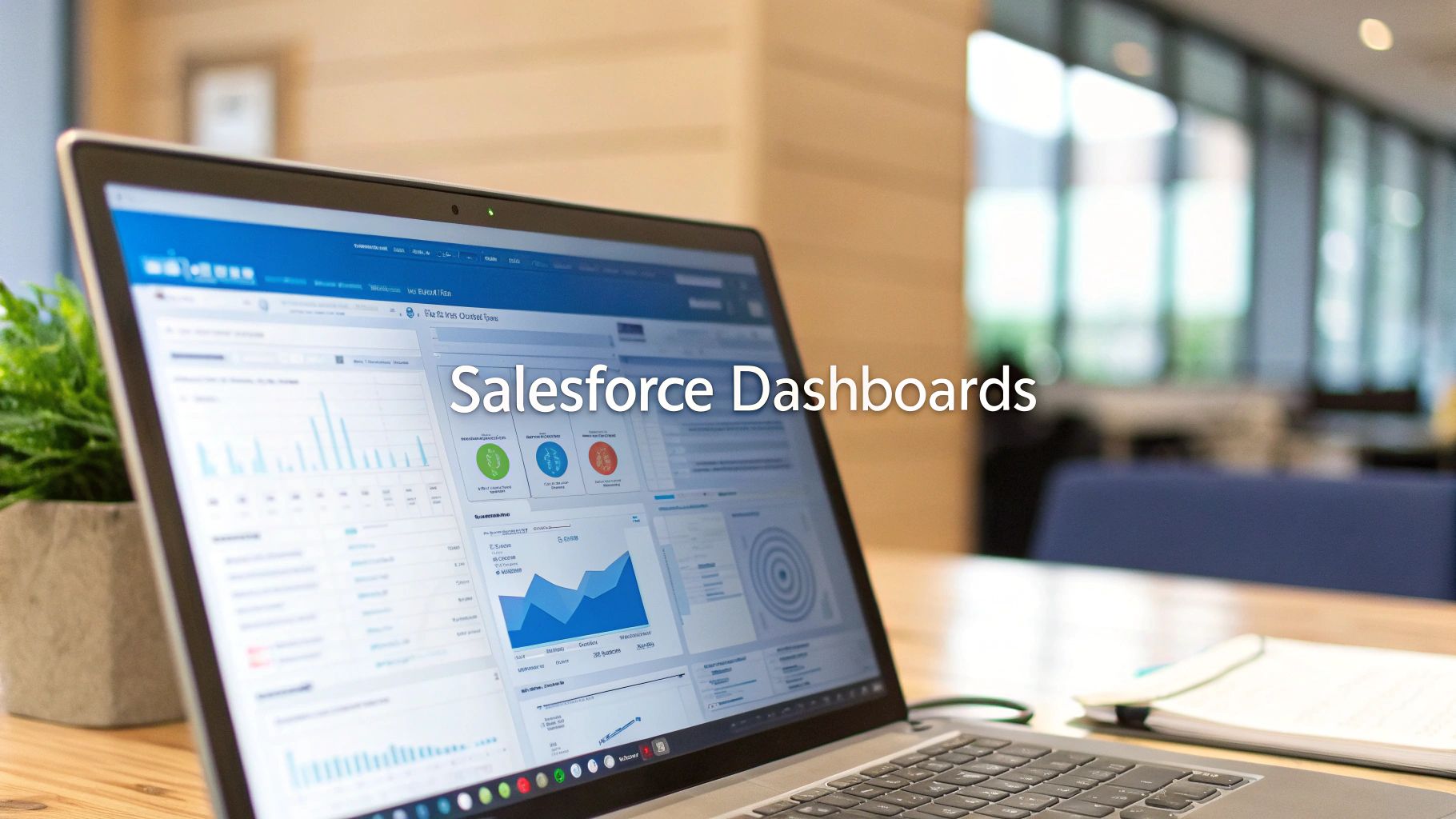
Building Your Dashboard Strategy

A common mistake is jumping directly into the dashboard builder, dragging and dropping components without a clear plan. The result is often a colorful but chaotic collection of data that provides little actionable insight. The most effective dashboards—those that drive decisions and optimize revenue operations—always start with a well-defined strategy.
The goal isn’t just to display data; it’s to answer critical business questions. For leaders in RevOps, marketing operations, or sales operations, this means defining the why behind every component. What action should this chart inspire? Who is the audience, and what information do they need to perform their roles more effectively?
Define Your Audience and Their Questions
First, identify who you are building the dashboard for. A dashboard for a Chief Revenue Officer should provide a high-level, 30,000-foot view of pipeline health and overall business performance. A sales manager, conversely, needs granular details on their team’s activities and deal progression to coach effectively.
Consider these common user personas in a B2B organization:
- Executives (CRO, CMO): They require top-line KPIs, such as pipeline created, closed-won revenue against targets, and marketing-influenced pipeline. Their fundamental question is, “Are we on track to achieve our revenue goals?”
- Managers (Sales, Marketing): They need operational metrics to manage their teams. They ask questions like, “Who are my top performers?” or “Which marketing campaigns are generating the most qualified leads?”
- Individual Contributors (AEs, BDRs): Their dashboards should focus on personal performance—activities completed, open opportunities, and progress toward quota.
Aligning KPIs to a specific role makes a dashboard more than just relevant; it makes it actionable.
The Critical Role of Data Integrity
A dashboard is only as reliable as the data feeding it. Many initiatives fail because teams bypass foundational data hygiene and build visualizations on a shaky foundation of inaccurate information. A preliminary data audit is not a “nice-to-have”—it is essential for building trust in the insights you present.
A dashboard built on untrustworthy data is worse than no dashboard at all. It actively misleads your team, encourages poor decision-making, and undermines its core purpose.
This means verifying that source reports pull from correct fields, data entry standards are enforced, and your overall data architecture is sound. Robust data governance is the bedrock of insightful analytics. If your systems require an audit, it’s wise to review best practices for data governance to strengthen your RevOps foundation.
Laying this strategic groundwork also clarifies which visualizations will tell your story most effectively. As you build your strategy, consider the principles behind effective analytics products to shape your vision.
According to a 2023 Salesforce Canada survey, 78% of Canadian organizations stated that custom dashboards improved their ability to monitor sales and customer engagement in real-time, demonstrating the significant ROI of a well-planned approach.
From Source Report to Live Dashboard
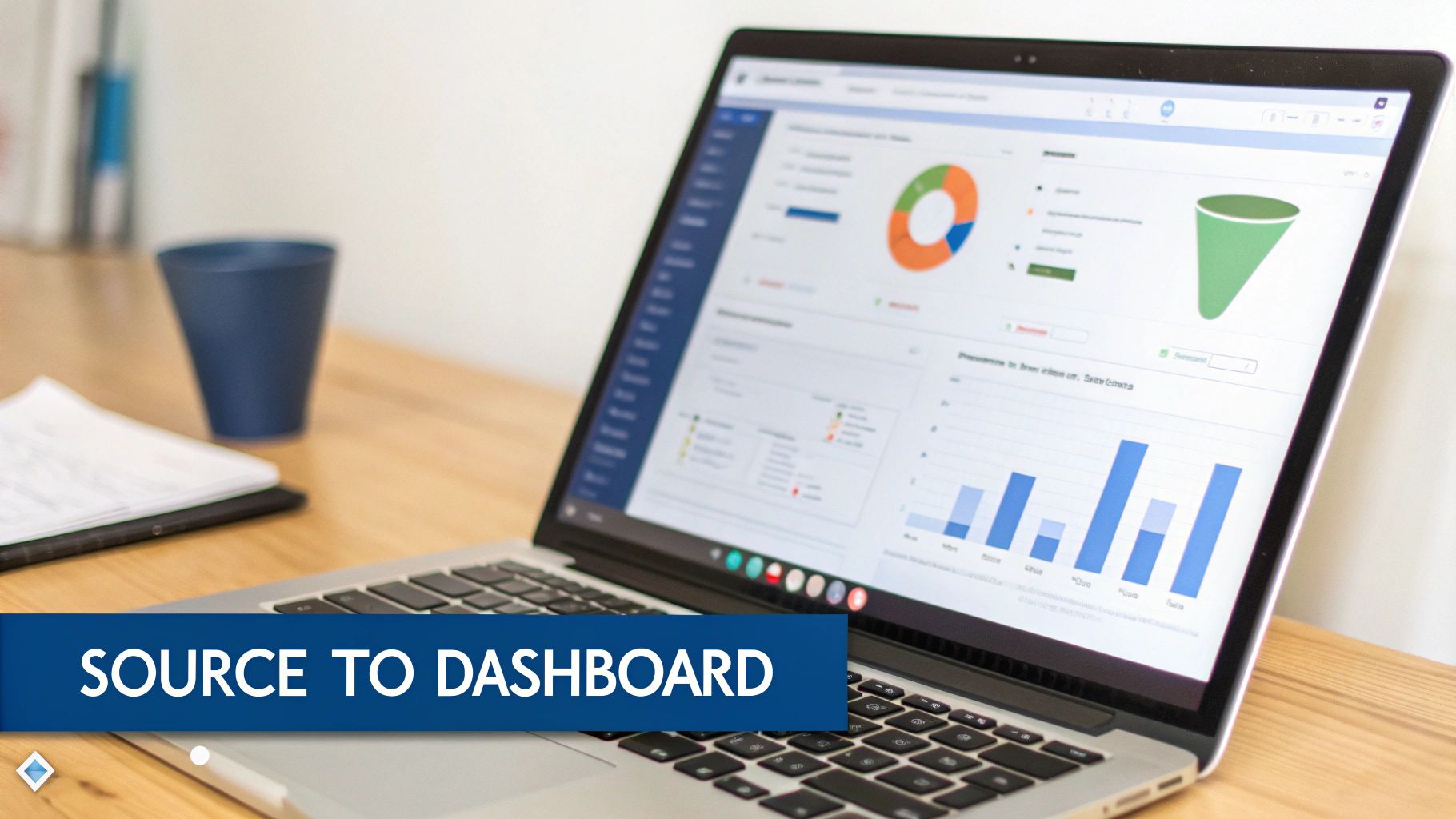
With a clear strategy and clean source reports, you can now bring your vision to life in the Salesforce Dashboard Builder. The process is straightforward, but the real skill lies in crafting a clear, compelling data narrative that drives action.
Laying the Dashboard Foundation
First, create the dashboard record. This starts with three crucial decisions: assigning a descriptive name, choosing a logical folder for storage, and defining its properties. A well-organized foundation simplifies maintenance and improves user experience.
A logical folder structure is critical for scalability. Avoid the common pitfall of a cluttered “Unfiled Public Reports” folder by organizing dashboards by team (“Marketing Dashboards,” “Executive KPIs”) or function (“Pipeline Generation,” “Campaign Performance”). This makes assets easy to locate.
Permissions are equally important. Define who needs to view and edit the dashboard from the outset. By setting folder permissions correctly, you secure sensitive information and ensure teams only see relevant data.
Connecting Components to Reports
A dashboard is a canvas, and its components—charts, gauges, and tables—are the visuals. Every component must be linked to a source report.
Each component should provide a direct, visual answer to a business question outlined in your strategy. The report supplies the data, and the component visualizes the answer. This live connection is what makes Salesforce dashboards so powerful; they are not static images but interactive windows into current business performance.
The best dashboards are built with intention. Each chart and table is selected for a specific purpose, working in concert to tell a coherent story. A random collection of visuals creates noise; a curated set of components delivers clarity.
Consider a common RevOps scenario: building a sales leaderboard to foster competition and track quota attainment.
- Goal: Identify which sales reps are closing the most revenue this quarter.
- Data Source: An “Opportunities Won This Quarter” report, grouped by Opportunity Owner with a sum on the Amount field.
- Optimal Visual: A horizontal bar chart provides an instant, easy-to-read comparison of performance.
For a classic marketing funnel dashboard, you need to track lead progression from MQL to closed-won.
- Goal: Pinpoint conversion rates and identify bottlenecks between key funnel stages.
- Data Source: A report on Leads and Opportunities, grouped by the Status or Stage field.
- Optimal Visual: The funnel component is designed specifically for this, clearly illustrating drop-off at each stage.
Configuring Components for Clarity
Once a component is connected to its report, you can fine-tune its appearance to highlight key insights. Add custom titles, adjust display units, and use conditional formatting to draw attention to important data points.
For the sales leaderboard, you could use conditional formatting to turn the bar green for any rep who has exceeded 100% of their goal. A manager can instantly see who is excelling. On a pipeline dashboard, you might highlight deals over a certain value. These visual cues distinguish a basic chart from a high-impact analytical tool.
Ultimately, a well-built component guides the viewer to critical insights. This requires a solid understanding of your data sources. If you need a refresher on preparing data for analysis, our guide on how to export data from Salesforce is a valuable resource. To ensure your dashboards reflect a complete view, a robust Salesforce CRM integration strategy is essential. This groundwork ensures every component is built on a complete and accurate data foundation.
Making Dashboards That Actually Drive Action

A standard dashboard provides information, but a customized dashboard drives action. The real value emerges when you transform a generic data display into a personalized command center using features like filters and dynamic dashboards.
For RevOps and marketing professionals, the objective is to create dashboards that are both comprehensive and laser-focused. Your team should not have to sift through irrelevant data to find what they need. Delivering insights tailored to a specific role or territory makes the leap from data to decision nearly instantaneous.
The Power of Dashboard Filters
Imagine managing sales performance across five different regions. Building five separate dashboards is a maintenance nightmare and clutters your Salesforce org. Dashboard filters are designed to solve this exact problem.
Filters allow you to build a single, master dashboard that your team can slice and dice on the fly. You create one source of truth—like an “Overall Pipeline Health” dashboard—and empower users to view it through the lens that matters most to them.
Common and effective filter applications include:
- Time Frame: Let users toggle between This Quarter, Last Quarter, or This Fiscal Year to spot trends.
- Territory or Region: A global sales leader can see the complete picture, while a regional manager can instantly zoom in on their specific area.
- Sales Rep or Owner: A sales manager can easily switch between individual reps to prepare for one-on-one meetings.
Setting up a filter is simple. From the dashboard builder, add a filter based on a field from your source reports, such as ‘Close Date’, ‘Opportunity Owner’, or a custom ‘Region’ field. This small step dramatically increases a dashboard’s utility by consolidating reporting and putting the user in control.
Unlocking Personal Relevance with Dynamic Dashboards
While filters let users choose what they see, dynamic dashboards take it a step further by automatically showing them data relevant to their role. A dynamic dashboard runs using the security settings of the viewer, not the creator.
In practice, you can build one “Sales Performance” dashboard. When an Account Executive opens it, they see only their pipeline and their activities. When their manager views the same dashboard, they see the combined data for their entire team.
A dynamic dashboard automatically respects your organization’s security hierarchy. It ensures an individual sees their world, a manager sees their team’s world, and an executive sees the whole picture—all from a single dashboard.
This is the key to scaling your reporting. Instead of building and maintaining a separate dashboard for every sales rep, you build one dynamic version.
Here’s a practical example:
- The Dashboard: “My Q3 Performance”
- Components: Open Pipeline by Stage, Activities Completed This Week, Closed Won vs. Quota.
- The Outcome:
- Sarah (Account Executive): Logs in and sees her personal pipeline value, her 15 completed calls this week, and her progress toward her individual quota.
- Dave (Sales Manager): Logs in and sees the aggregated pipeline for his entire team, total activities completed, and the team’s overall quota attainment.
This approach not only saves significant administrative effort but also drives adoption. When users see data reflecting their personal contribution and goals, the dashboard becomes an essential part of their workflow.
Driving Adoption and Performance
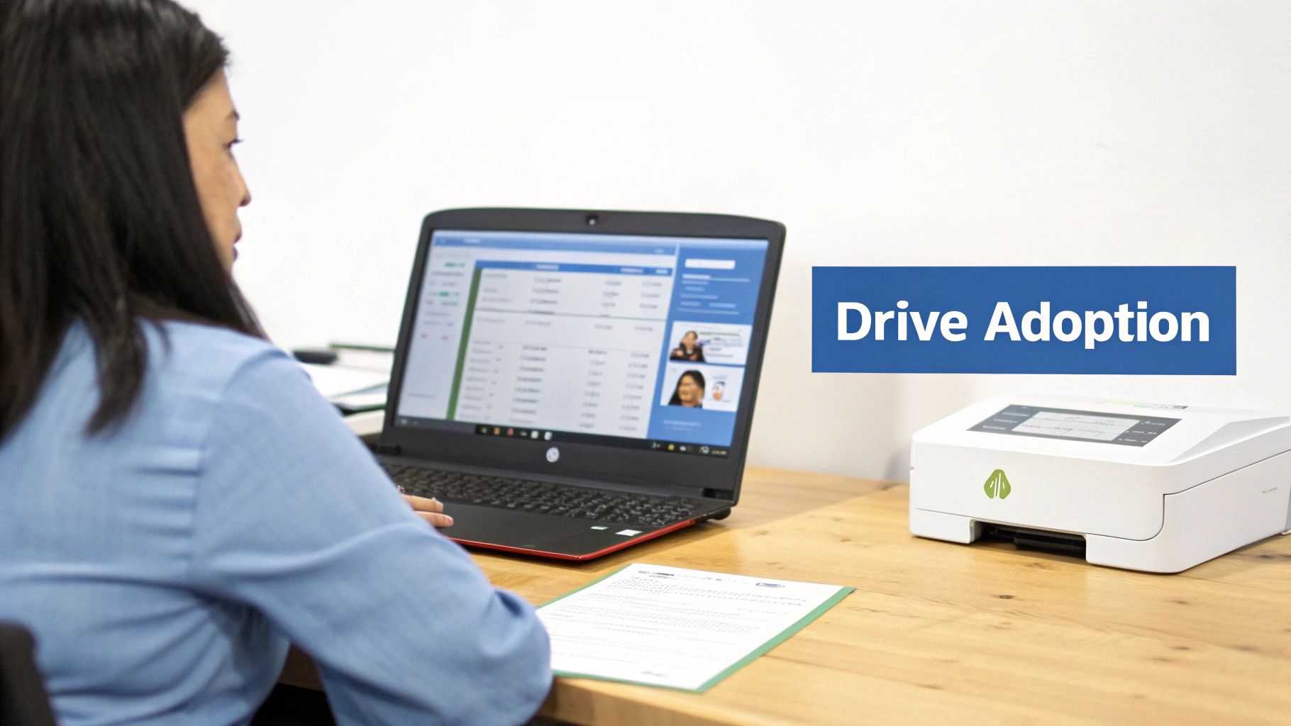
Building a technically perfect dashboard is only half the battle. The most sophisticated visualizations are useless if they go unused. The real challenge—and value—lies in weaving these dashboards into the daily fabric of your team’s workflow, turning a reporting tool into an indispensable habit.
True adoption is the result of a deliberate strategy focused on making dashboards accessible, timely, and continuously improving. When users can get the insights they need without friction and trust the data is current, they will begin to rely on it, shifting the team’s mindset from reactive data pulls to proactive, data-informed decisions.
Make Your Dashboards Easy to Find and Always Fresh
The biggest barrier to adoption is often friction. If a sales manager cannot find the Q3 pipeline dashboard in under 15 seconds, they will revert to their old spreadsheets. A chaotic folder structure is a common, self-inflicted wound that kills adoption.
Implement meticulous organization from day one.
- Set Up a Logical Folder Structure: Group dashboards in a way that aligns with your teams, such as “Marketing Dashboards,” “BDR Performance,” or “Executive KPIs.” Lock down permissions so users only see relevant folders, reducing clutter and enhancing security.
- Use a Smart Naming Convention: A name like “Pipeline Dashboard – Q3 by Rep” is far more useful than “New Dash v2.” Be descriptive and consistent so your team knows exactly what they’re clicking on.
Timeliness is equally crucial. Stale data erodes trust and makes dashboards irrelevant. Automating data refreshes is non-negotiable for maintaining credibility.
Stale data is misleading data. For an operational dashboard like a daily sales activity tracker, schedule a refresh every morning. This ensures it becomes a reliable source for daily planning, not a historical artifact.
You can also push insights directly to key stakeholders using subscriptions. For instance, schedule the “Weekly Marketing KPI Summary” dashboard to be delivered to your CMO’s inbox every Monday at 8 AM. This proactive delivery keeps key metrics top-of-mind and integrates reporting into their routine.
From Rollout to Ritual
Announcing “we have new dashboards” in a company-wide email is not an effective rollout strategy. You need a solid plan to educate your team, demonstrate value, and establish a feedback loop for continuous improvement. This is how you transform a one-time project into a living part of your company’s operational culture.
Focus on enablement and engagement to drive this shift.
- Run Targeted Training Sessions: Don’t just show them what the dashboard is; show them how it makes their jobs easier. A focused 20-minute session for the sales team could cover using the “Open Pipeline” dashboard to plan their week and identify at-risk deals.
- Create a Simple One-Pager: Develop a quick reference guide that explains what each chart measures and what defines “good” or “bad” performance. This helps everyone interpret the data correctly.
- Actively Solicit Feedback: Check in with users after a few weeks. Ask them directly: What’s working? What’s confusing? What’s missing? An Account Executive might suggest adding a component to track a specific marketing campaign—a valuable insight you might have missed.
This iterative process not only improves the dashboard but also fosters a sense of ownership among the team.
By constantly iterating based on user feedback, you ensure dashboards evolve with the business. This approach is particularly powerful when tracking complex metrics. For example, building dashboards that accurately reflect marketing’s contribution requires a deep understanding of your data models. Our guide on understanding Salesforce Campaign Influence can provide valuable context for creating more meaningful marketing performance dashboards that your team will actually use.
Going Beyond the Basics: Common Traps and Pro-Level Strategies
Once you are comfortable building and sharing Salesforce dashboards, it’s time to think strategically. Advancing from a good dashboard builder to a great one involves recognizing common pitfalls and knowing which advanced tools to leverage for high-value business questions.
The best dashboards are ruthlessly focused. They cut through the noise to spotlight the few metrics that truly move the needle. A common mistake is building dashboards packed with “vanity metrics”—numbers that are easy to measure but have no real connection to revenue or strategic goals. A high number of social media impressions may look good on a chart, but what does it reveal about qualified leads or pipeline growth?
Constantly ask “so what?” for every component. If a chart doesn’t help someone make a smarter decision about where to invest time, money, or energy, it’s just clutter.
Don’t Overwhelm Your Audience
Another classic error is cramming too much data onto one screen, creating a “spaceship control panel” that causes analysis paralysis. It becomes impossible to spot what’s important.
Remember, the goal is not to show everything; it’s to show what matters.
A clean, scannable layout is essential. Use this simple framework to design dashboards that tell a story:
- Top-Left is Prime Real Estate: Place your most critical, high-level KPIs in the top-left corner, as this is where the eye naturally looks first. Think “Total Pipeline Created This Quarter” or “Closed Won vs. Target.”
- Create a Logical Narrative: Arrange components to guide the user’s focus. Start with outcomes (revenue), then show leading indicators (pipeline, activities), and finally, offer diagnostic details (conversion rates by stage).
- Embrace White Space: Do not be afraid of empty space. It gives data room to breathe, separates distinct ideas, and makes the entire dashboard easier to digest at a glance.
Prioritizing clarity over density creates a tool people want to use. Your stakeholders should get the answers they need in seconds, not minutes.
Unlocking Deeper Insights with Joined Reports
As your business questions become more complex, you will encounter the limitations of standard reports. How do you compare open opportunities against deals won in the same period? How do you view open support cases alongside open opportunities for key accounts? A single report cannot accomplish this.
This is where joined reports become a game-changer.
A joined report allows you to combine data from multiple report types into a single, unified view. You can use up to five separate report “blocks,” each with its own filters, columns, and sorting rules.
A joined report functions as a mini-dashboard in itself. It is the key to creating powerful, side-by-side comparisons that provide a holistic view across different business functions.
For example, a revenue operations leader could build a joined report with three blocks:
- Block 1: All open pipeline for the current quarter.
- Block 2: All closed-won deals from this same quarter.
- Block 3: All Marketing Qualified Leads (MQLs) generated this quarter.
Adding that joined report to a dashboard creates a powerful chart showing your entire revenue funnel. It’s an advanced technique for connecting previously siloed datasets.
Extending Your Toolkit with the AppExchange
While Salesforce provides powerful native tools, you may encounter specific needs for unique visualizations or advanced analytical features. Before considering custom development, your first stop should always be the Salesforce AppExchange.
The AppExchange is a marketplace of third-party applications that can elevate your dashboards.
Whether you need sophisticated geo-mapping to visualize sales territories, complex waterfall charts for tracking goals, or a wider library of chart types, an app likely already exists. These solutions can save significant development time and provide polished, pre-built components designed to solve specific business intelligence challenges.
Common Questions About Salesforce Dashboards
When first diving into Salesforce analytics, several key questions frequently arise. Addressing these fundamentals from the start will save you significant time and effort.
What’s the Real Difference Between a Report and a Dashboard?
This is the most common point of confusion. A report is the raw material—a detailed list of records that you have filtered and organized. It is the spreadsheet-style view containing all the rows and columns of data.
A dashboard, on the other hand, is the visual storyteller. It takes the data from one or more reports and transforms it into an easily digestible format, such as a chart, gauge, or metric. You always need a report to source the data; the dashboard is how you bring that data to life.
How Often Can My Dashboards Refresh?
Stale data undermines a dashboard’s credibility. Salesforce allows you to schedule automatic refreshes on a daily, weekly, or monthly basis. This ensures your team is always looking at the latest numbers.
You can also specify the refresh time. For example, if your sales team has a stand-up at 9:00 AM, set the refresh for 8:30 AM. This small detail establishes the dashboard as a reliable, go-to resource.
Help! Why Is My Dashboard Component Showing an Error?
An error message on a dashboard component can be frustrating, but the problem typically lies with the source report, not the dashboard itself. Your first step should always be to investigate the underlying report.
The most common causes for a broken component include:
- The source report was deleted or moved: This leaves the dashboard component with no data to display.
- Permissions were changed: The user viewing the dashboard may lack access to the folder where the source report is saved.
- The report’s structure was modified: If a field or grouping that the component relies on was removed from the report, the component will break.
When a component shows an error, your first instinct should be to check the source report. Can you still run it? Are the permissions correct? This simple diagnostic check will resolve the issue most of the time.
Mastering these fundamentals allows you to spend less time troubleshooting and more time building dashboards that help your RevOps and marketing teams make smarter, data-driven decisions.
At MarTech Do, we specialize in transforming your Salesforce data into a strategic asset. If you’re ready to build dashboards that align your teams and drive measurable growth, learn more about how our revenue operations expertise can help. Visit us at https://www.martechdo.com.