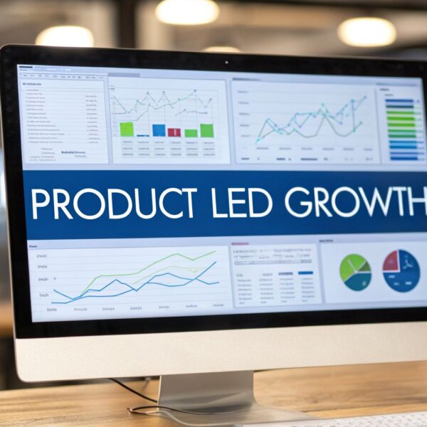
Building a dashboard in Salesforce is more than a technical exercise; it’s about creating a visual command center for your entire go-to-market strategy. This guide shows you how to transform static reports into an interactive narrative that reveals where your revenue engine is performing and where it requires optimization.
Your Dashboard Is More Than Just Charts
A Salesforce dashboard is not merely a collection of charts and graphs. For a B2B company, it serves as the operational hub where RevOps, marketing, and sales strategies converge. A well-designed dashboard translates complex data from Salesforce, MCAE (formerly Pardot), and other integrated platforms into a coherent, actionable story.
Adopting this strategic mindset is crucial before you begin building. View this not as a reporting task, but as the creation of a strategic asset that will guide business decisions. To understand what makes a visual truly effective, it’s worth exploring these performance dashboard examples to see what is possible.
The Strategic Value For RevOps Leaders
For marketing operations and RevOps leaders, a dashboard provides essential clarity. It is the tool that aligns departments and maintains focus on growth. It enables a shift from reactive reporting to proactive, data-driven decision-making.
A powerful dashboard helps you achieve several key objectives:
- Identify Pipeline Bottlenecks: Pinpoint exactly where leads are stalling in the funnel long before it impacts your forecast.
- Align Sales and Marketing: Create a single, shared view of the entire customer journey, from the first campaign touchpoint to a closed-won deal.
- Measure Initiative Impact: Draw a direct line from specific marketing campaigns and sales activities to revenue outcomes.
- Drive User Adoption: In Canada, building dashboards in Salesforce is a significant driver for improving team efficiency. Teams with high dashboard adoption often see weekly active user logins exceed 70%, which naturally improves data hygiene.
A great dashboard doesn’t just display data; it tells a story. It answers your most pressing business questions at a glance—like “Are we on track to hit our target?” and “Which marketing channels are delivering the most valuable leads?”
Ultimately, the goal is to connect day-to-day operations with revenue growth by establishing a single source of truth. This empowers everyone in the organization, from a sales representative reviewing their pipeline to a CMO measuring marketing ROI.
Prepare Your Data for a Powerful Dashboard
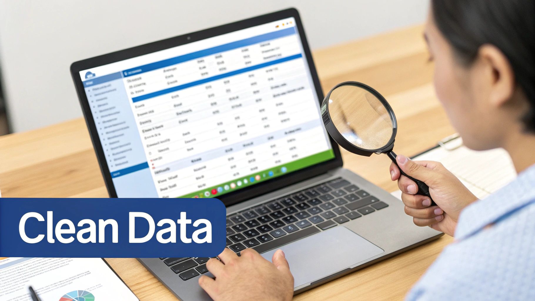
An insightful dashboard is built on a foundation of clean, reliable data. This is the most critical step, yet it is often rushed, leading to dashboards that fail to deliver value. Before dragging a single component onto the canvas, you must complete the necessary groundwork.
This foundational work begins by asking: what core RevOps metrics does your business truly care about? From there, you must ensure the data you’re pulling can genuinely answer those strategic questions.
A dashboard is only as good as the reports that feed it. If your reports are built on messy or incomplete data, your dashboard will amplify those flaws, leading to mistrust and poor decision-making.
Define Your Core Metrics and Reports
First, collaborate with your team to identify the key performance indicators (KPIs) that accurately measure the health of your revenue engine. Be selective. Avoid vanity metrics and concentrate on numbers that drive action. For any B2B team, this means moving beyond simple lead counts to more meaningful business metrics.
Once you have defined your KPIs, you can build the source reports that will power your dashboard components. Every chart, gauge, and table on your dashboard pulls directly from an underlying report.
Here are a few actionable examples we recommend:
- Lead Velocity Rate (LVR): Tracks the month-over-month growth in qualified leads, serving as a powerful leading indicator of your future sales pipeline. To build it, you need a report that groups new qualified leads by their creation month.
- Pipeline by Stage and Age: Essential for monitoring pipeline health. Your report should show the value of open opportunities, grouped by sales stage. We also recommend adding a formula field to calculate how long each deal has been in its current stage to identify stalled opportunities.
- Marketing Source ROI: Connect closed-won opportunities back to their original campaign or lead source. This report provides a clear picture of which channels are delivering actual revenue, allowing for optimized budget allocation.
Prioritize Data Hygiene and Structure
With your core reports defined, the next crucial step is to ensure the data within them is accurate. This is a common stumbling block. Inconsistent data entry, duplicate records, and incomplete fields can render an otherwise well-designed dashboard useless.
Performing regular data hygiene checks is non-negotiable. This involves more than a one-time cleanup; it requires establishing clear, documented processes for data entry and governance. For a deeper look, our guide on how to improve data quality offers actionable strategies you can implement immediately.
The structure of your source reports is equally important. Use precise filters to include only the necessary data. For instance, a report for “This Quarter’s Pipeline” should be filtered by Close Date = THIS QUARTER and Stage NOT EQUAL TO Closed Won, Closed Lost. Using summary-level formulas in the report builder to calculate metrics like win rates or average deal sizes will make your dashboard components cleaner and faster to load.
Bringing Your Dashboard to Life, Component by Component
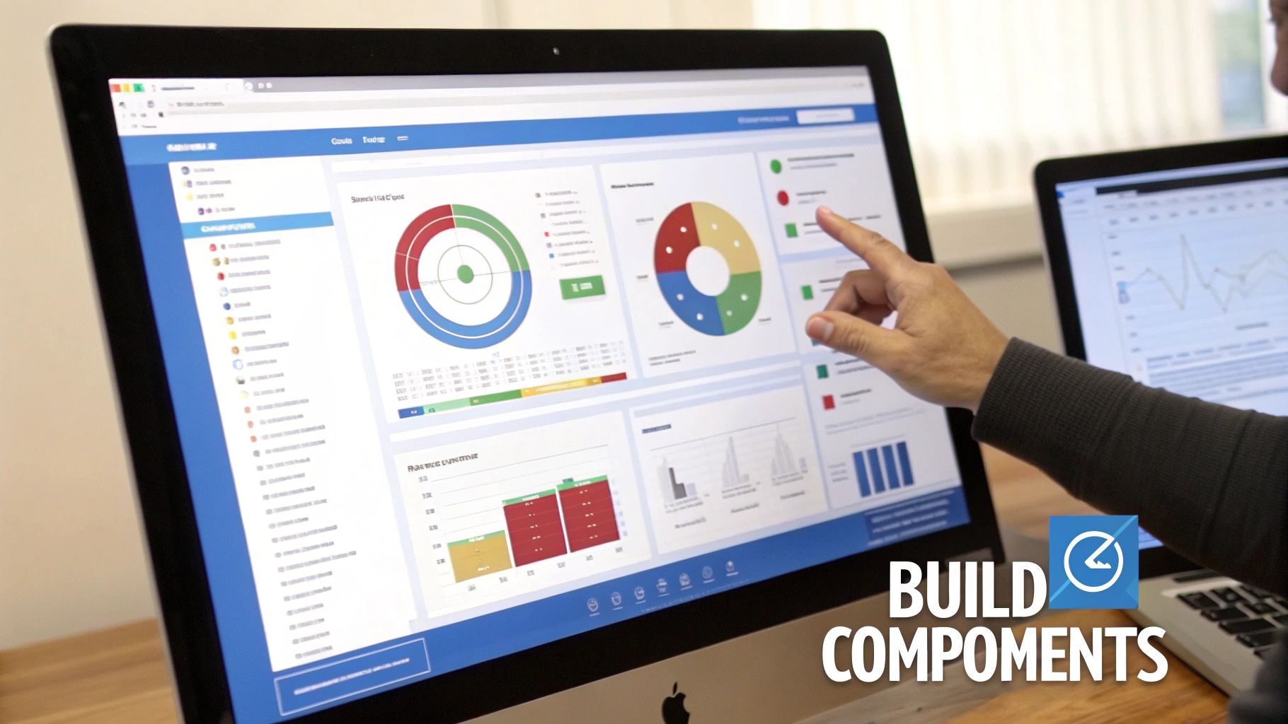
The Salesforce Lightning Dashboard Builder is your canvas. Here, you will transform your carefully crafted source reports into a clear, intuitive story for your entire go-to-market team.
With your reports clean and well-structured, you can now translate that data into a visual reality. This is where your RevOps strategy truly takes shape. We are not just plugging in charts; we are making deliberate choices to present data in the most compelling way possible.
To begin, navigate to the Dashboards tab and create a new one. Give it a descriptive name that is meaningful to your team—such as “Go-to-Market Performance”—and save it in an appropriate folder. This action launches the dashboard builder, where you will add your first component. Each component is a direct visualization of one of your underlying reports.
Choosing the Right Visualization for the Right Story
The most critical decision for each component is selecting the right chart type. The same data can tell vastly different stories depending on its presentation. Your choice should always be driven by the specific question you want that component to answer at a glance.
A great dashboard is about choosing the right tool for the job. Here’s a quick guide to help you match your metric to the best visualization.
Choosing the Right Dashboard Component for Your Metric
| Metric Type | Recommended Component | Best Used For |
|---|---|---|
| Progress to Goal | Gauge | Showing a single value against a fixed target, like quarterly quota attainment. |
| Category Comparison | Bar Chart | Comparing discrete items, such as lead source performance or sales rep pipeline. |
| Single Key Number | Metric | Highlighting one crucial figure, like total open pipeline value for the quarter. |
| Trend Over Time | Line Chart | Tracking a metric’s performance over a period, like month-over-month lead growth. |
| Detailed Data | Table | Displaying record-level details, like your top 10 open deals ranked by amount. |
Ultimately, the goal is to make the data easy to digest. A Gauge, for instance, is perfect for showing progress against a quota with its immediate red-yellow-green feedback. However, it is a poor choice for comparing multiple categories, where a Bar Chart excels.
Building Our Go-to-Market Dashboard
Let’s apply these principles to our “Go-to-Market Performance” dashboard. We will add components that provide a holistic view of the revenue engine, arranging them logically to guide the viewer’s eye from one insight to the next.
- Lead Velocity Rate (LVR): We’ll use a Line Chart. It is the ideal format for showing trends, making it instantly clear whether qualified lead volume is growing month-over-month.
- Pipeline by Stage and Age: A Stacked Bar Chart is perfect here. Each bar can represent a month, with segments showing the value of opportunities in each stage. This provides a fast, clear picture of the health and maturity of our future pipeline.
- Marketing Source ROI: To visualize which channels drive the most revenue, a horizontal Bar Chart is a clear winner. We will sort it in descending order to instantly spotlight our top performers.
- Sales Team Quota Attainment: A classic use case for a Gauge component. We can build one for the overall team target, giving executives a real-time snapshot of progress.
As you add these components, consider their relationship to one another. A dashboard should be an integrated system, not a random collection of charts. Insights from one component should naturally lead to questions answered by another. This cohesion is central to a successful dashboard and relies on the principles of effective platform integration.
A great dashboard is arranged with intent. Place high-level summary metrics (like total pipeline or quota attainment) at the top. Follow with trend charts and comparison visuals, and place detailed tables at the bottom for users who want to dig deeper.
Go Beyond Static Views with Dynamic Features
A static, one-size-fits-all dashboard has its limits. Once you have mastered the basics of building a dashboard in Salesforce, you can unlock its true potential by using dynamic features. This is how you transform a simple report card into an interactive analytics hub that your team will actively use.
These features convert your dashboard from a passive display into a powerful, self-service tool for your entire go-to-market team.
Let Users See Their Own World with Dynamic Dashboards
A Dynamic Dashboard is invaluable, especially within a complex sales or marketing hierarchy. A standard dashboard shows data from the perspective of a single “running user.” In contrast, a dynamic dashboard adapts to show data based on the permissions of the individual viewing it.
Consider the application: a sales representative logs in and sees only their pipeline. Their manager logs in to the exact same dashboard and sees data for their entire team. The CRO views it and gets performance metrics for the whole department. This eliminates the need for RevOps to build and maintain dozens of nearly identical dashboards, saving significant time.
Dynamic dashboards are incredibly effective for:
- Personalized Performance Tracking: Representatives can monitor their individual quota attainment and pipeline health.
- Team Management: Sales leaders get a clean, consolidated view of their direct reports’ activities and results.
- Upholding Data Security: The feature automatically respects your organization’s sharing rules, ensuring users only see authorized data.
Note: Salesforce limits the number of dynamic dashboards you can create (typically 5 for Enterprise Edition and 10 for Unlimited). Reserve them for your most critical use cases, like individual pipeline management or performance scorecards.
Encourage Curiosity with Dashboard Filters
One of the best ways to drive dashboard adoption is to empower users to answer their own questions. Dashboard filters achieve this by allowing stakeholders to slice and dice the data directly on the dashboard without modifying the underlying reports.
For example, if a marketing leader wants to check the pipeline generated by a specific campaign, they can simply select that campaign from a filter you have added. This interactivity makes the data instantly more valuable and accessible.
You can add up to three filters per dashboard, allowing users to drill down by common criteria like:
- Date Range
- Territory or Region
- Lead Source
- Opportunity Owner
For more specialized views, particularly around financial metrics, a tool like the Financial Insights Dashboard can offer the kind of deep-dive business intelligence that finance and leadership teams need.
Automate Delivery with Subscriptions
A dashboard is useless if no one sees it. Dashboard subscriptions are your tool for ensuring your work gets noticed. This feature automatically emails a fresh view of the dashboard to specific users, groups, or roles on a schedule you set—daily, weekly, or monthly.
By pushing critical data directly into your stakeholders’ inboxes, you make it part of their routine. This ensures everyone is aligned and working from the most current information, which is key to fostering a data-driven culture.
Put AI to Work for Predictive Dashboard Intelligence

The future of RevOps lies not in looking backward, but in anticipating what’s next. AI-powered analytics are transforming dashboards from static reports into strategic, forward-looking tools.
Salesforce’s AI is designed to automatically identify trends, deliver more reliable revenue forecasts, and suggest actions that a human might miss. This allows your team to shift from reacting to last quarter’s results to proactively shaping next quarter’s strategy.
From Reporting to Predicting
Imagine a dashboard that does more than show which deals are at risk. Imagine it flags those same deals because it detected subtle changes in email sentiment or a drop-off in engagement data from your marketing automation platform. That is the power of AI.
For instance, an AI-enhanced component can analyze thousands of data points to pinpoint which marketing channels are most likely to attract customers with the highest lifetime value—not just those that generate the most clicks. For RevOps leaders, such insights are invaluable for optimizing budgets and focusing efforts.
This is not hypothetical. Canadian companies that have adopted AI-enhanced dashboards are seeing an average revenue increase of 15-20%. This growth stems directly from faster, more accurate pipeline forecasting and smarter customer engagement. These systems provide insights that help sales and support teams resolve common challenges and work more effectively. You can learn more about how Canadian businesses are adopting AI and the results they are achieving.
Actionable AI-Driven Insights
When building a dashboard in Salesforce with AI, you add a new layer of intelligence. The system learns from your historical data to serve up useful, context-aware suggestions directly within the dashboard.
Here are a few real-world applications:
- Deal Health Scoring: AI can create a dynamic “health score” for every open opportunity by analyzing factors like meeting reschedules and the tone of recent email exchanges.
- Smarter Lead Prioritization: Moving beyond simple lead scoring, AI can analyze a lead’s behavior to predict their likelihood of converting and then recommend the best next action for a sales representative.
- Proactive Churn Alerts: By monitoring product usage and support ticket patterns, an AI-powered dashboard can flag accounts showing early warning signs of churn, allowing your customer success team to intervene proactively.
AI fundamentally shifts the purpose of a dashboard. It transitions from a place to find answers to a tool that brings you the answers, often before you have even thought of the question.
Answering Your Top Salesforce Dashboard Questions
Even the most well-planned dashboard strategy can encounter practical roadblocks. During the building process, certain questions consistently arise from RevOps and marketing operations leaders.
Here are direct, actionable answers to solve these common challenges.
How Often Should I Refresh My Dashboard Data?
The optimal refresh frequency depends on the rhythm of your business and how quickly your team needs to act on the information.
Consider the use case. A fast-paced inside sales team tracking daily quotas needs near real-time data, making an hourly refresh appropriate. Conversely, a marketing team analyzing the long-term ROI of a content strategy may only require a weekly update.
The goal is to align data freshness with the speed of the decisions it informs. You can automate this process using the Subscribe feature on any dashboard. Set the frequency, add your stakeholders, and Salesforce will automatically email them the latest snapshot, ensuring everyone is aligned.
When Should I Use a Dynamic Dashboard?
Use a standard dashboard when you need a single source of truth for team-wide KPIs, such as company leaderboards or overall marketing performance. It shows the same data to everyone based on the access of a specific “running user.”
Switch to a dynamic dashboard when the data needs to be personalized. A dynamic dashboard shows data based on the permissions of the person viewing it. A sales director sees their team’s pipeline, while an individual account executive viewing the same dashboard sees only their own deals. It is ideal for one-on-ones, pipeline reviews, and personal performance tracking.
Keep in mind that Salesforce limits the number of dynamic dashboards you can have—typically 5 for Enterprise Edition and 10 for Unlimited. As a scarce resource, reserve them for high-impact, personalized views to maximize their value.
Why Is My Dashboard Component Showing an Error?
When a component fails, the problem is almost always the source report, not the dashboard itself. Before rebuilding a component, investigate the report it is built on.
Use this troubleshooting checklist:
- Does the source report still exist? Reports can be accidentally deleted or moved.
- Can the dashboard’s “running user” see the report? Folder permissions are a common and often overlooked cause of errors.
- Has the report’s structure changed? If a component relies on a specific grouped column or formula field that was removed from the report, the component will break.
Verifying the source report’s health and permissions will resolve the vast majority of component errors.
At MarTech Do, our specialty is turning your Salesforce data into a genuine strategic asset. If you want to build dashboards that finally get your sales and marketing teams aligned and driving real growth, we’re here to help. Learn how our RevOps expertise can optimize your entire go-to-market strategy.