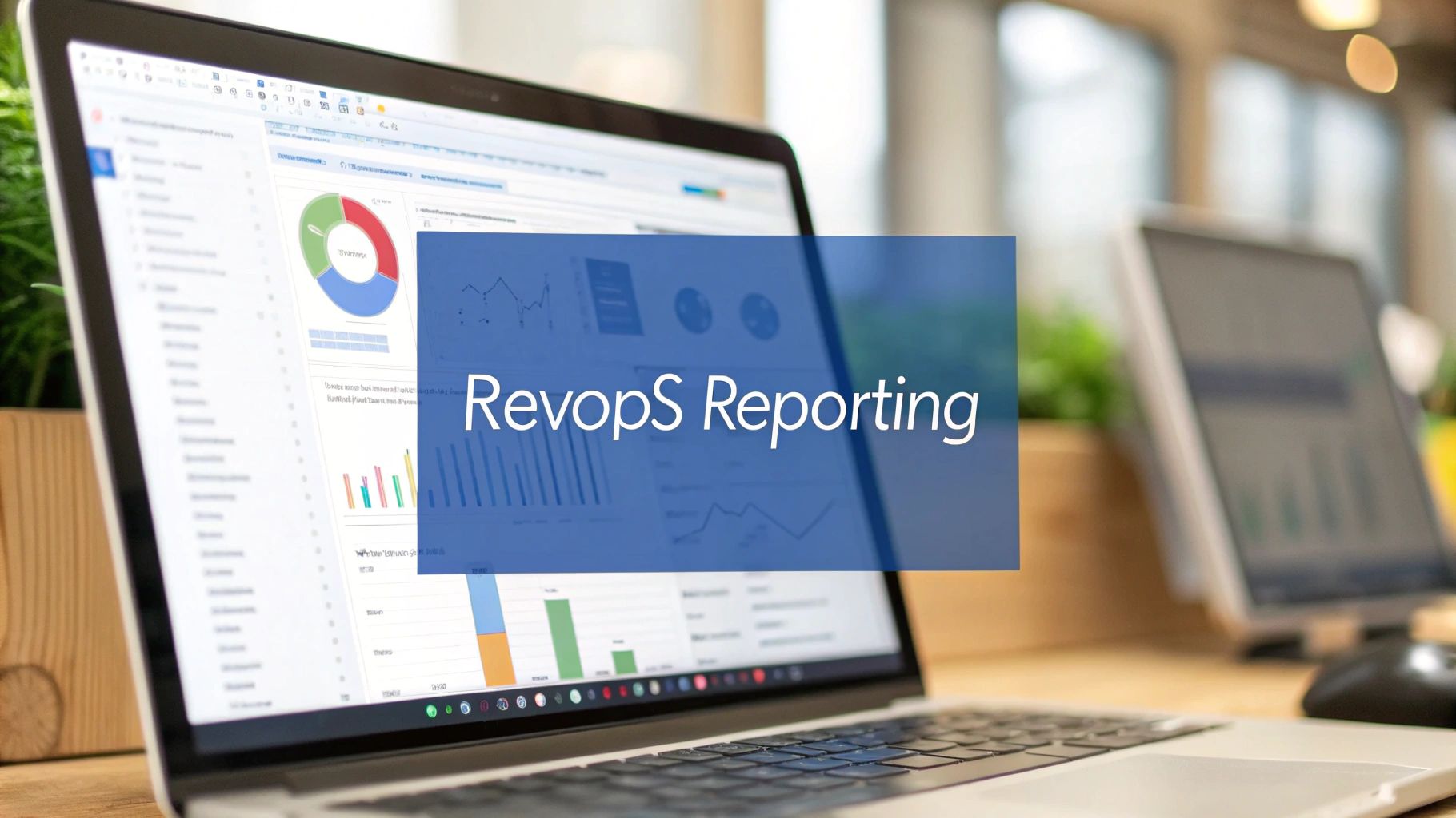
For any Revenue Operations team, mastering Salesforce reports is a foundational requirement. This isn’t just about pulling numbers; it’s about establishing a single source of truth that fuels your entire go-to-market engine. When executed correctly, B2B companies can transition from guesswork to data-driven clarity, aligning marketing, sales, and service with actionable insights.
Why Salesforce Reporting Is a RevOps Game-Changer
Disconnected data, unreliable forecasts, and an opaque pipeline are common challenges that impede B2B growth. Without a unified view of performance, marketing struggles to demonstrate ROI, sales operations cannot accurately predict outcomes, and leadership is forced to make strategic decisions without complete information.
This is precisely where a well-defined Salesforce reporting strategy delivers a significant competitive advantage.
By mastering reports, you transform raw data into a coherent business narrative. This capability allows you to draw a direct line from a marketing campaign to a closed-won opportunity, monitor pipeline health in real-time, and identify friction points in the revenue cycle. For a deeper dive into this interconnected framework, our guide on what Revenue Operations is provides essential context. A unified data view is no longer a luxury; it is the bedrock of strategic decisions that drive efficiency and revenue.
The Strategic Value of a Unified Data View
The core purpose of RevOps is to ensure all go-to-market functions operate from a single, consistent playbook. When marketing, sales, and customer success leverage the same underlying data, strategic alignment becomes a natural outcome.

When your information is centralized, teams can focus on collaborative problem-solving instead of debating data accuracy. Every department is oriented toward the same revenue goals because they are all referencing the same performance metrics.
This alignment is especially critical for B2B companies using Salesforce as their primary CRM. Salesforce holds a commanding market share, and its adoption continues to grow as businesses rely on the platform to manage complex GTM strategies.
For RevOps leaders, the goal isn’t just to create reports; it’s to build an information ecosystem. Your dashboards should tell a story—from the first marketing touchpoint to the final closed-won deal—enabling every team member to see their impact on revenue.
Key Benefits for RevOps Teams
Developing a robust capability for creating reports in Salesforce delivers tangible, bottom-line benefits. It elevates your operations team from a reactive, data-pulling function to a proactive, strategic partner that informs key business decisions.
Here’s what you stand to gain:
- Improved Forecasting Accuracy: Base revenue predictions on historical data and real-time pipeline velocity, not intuition.
- Enhanced Pipeline Visibility: Instantly identify bottlenecks, pinpoint stalled deals, and allocate resources to stages requiring intervention.
- Data-Driven Decision Making: Equip leadership with clear, concise dashboards that distill complex data into the KPIs and trends that matter.
- Increased Cross-Functional Alignment: Unify all departments around a shared set of metrics, making collaboration the default operational mode.
Building Your Foundation with Standard Report Types
Before constructing the powerful, custom dashboards that guide your go-to-market strategy, it is essential to master the fundamentals. Salesforce provides four core report types that serve as the building blocks for virtually any analysis. Knowing which type to use for a specific business question is a critical skill for any marketing or sales operations professional tasked with delivering actionable insights.
Think of these standard formats as different lenses for viewing your data. The correct choice determines whether a report answers a strategic question or simply presents a confusing data dump. This foundational knowledge is necessary to create powerful reports in Salesforce that your teams will actively use.
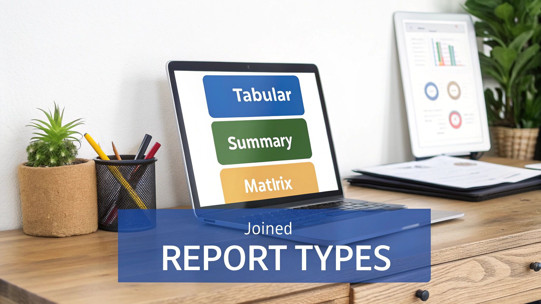
Tabular Reports: The Quick Data Export
A Tabular report is the most straightforward format, presenting data in simple rows and columns, much like a spreadsheet. It is the ideal tool when you need a clean list of records without groupings or subtotals.
While it lacks advanced data visualization capabilities, its strength lies in its simplicity and efficiency for data extraction.
- Real-World Example: A marketing operations manager needs a list of all contacts who attended last week’s webinar for an upload into an Account Engagement (Pardot) engagement studio. A Tabular report provides a no-fuss export of names, titles, and email addresses.
Summary Reports: Grouping for Clarity
When you need to organize and analyze your data with subtotals, a Summary report is the appropriate choice. This format allows you to group rows of data by specific fields—such as opportunity stage or lead source—and display subtotals for key metrics like deal value.
This is where true analysis begins. By grouping data, you can identify trends and patterns that are invisible in a flat list.
A Summary report instantly transforms a long, flat list of deals into a structured pipeline view. Simply grouping by ‘Stage’ and summing the ‘Amount’ immediately shows you the total value sitting in each part of your funnel. It’s instant pipeline visibility.
For instance, a sales operations leader can use a Summary report to group open opportunities by sales rep. This quickly shows pipeline distribution across the team, highlighting individual performance and informing weekly sales meetings.
Matrix Reports: The Two-Dimensional View
To conduct a deeper analysis, a Matrix report allows you to group records by both rows and columns simultaneously. This is your go-to format when you need to compare related totals across two different categories.
Functionally similar to a pivot table, a Matrix report is incredibly powerful for identifying correlations and gaining a high-level overview of complex datasets directly within Salesforce.
- Real-World Example: A RevOps manager analyzes the new business pipeline generated this quarter. They could build a Matrix report grouping opportunities by Account Owner (rows) and Lead Source (columns), with the sum of the opportunity amount as the value. This view reveals not only which reps are generating the most pipeline but also which marketing channels are most effective for each rep.
Joined Reports: Connecting Different Data Views
The Joined report is the most sophisticated standard type, allowing you to combine up to five distinct report “blocks” into a single view, even if their underlying objects are not directly related. Each block can have its own unique columns, filters, and sorting.
This is the report you build when you need to bridge different business functions and create a single source of truth across disparate datasets.
For example, a Head of Customer Success might hypothesize that accounts with numerous open support cases are at a higher risk of churn. A Joined report can validate this by displaying two blocks side-by-side: one showing open cases grouped by account, and another showing lost opportunities from those same accounts. This unified view makes it easy to correlate service issues with revenue loss.
To simplify the selection process, here is a quick guide for choosing the right format based on your objective.
Choosing the Right Salesforce Report Type for Your Goal
| Report Type | Best Used For | Common RevOps Use Case |
|---|---|---|
| Tabular | Creating simple lists or exporting raw data without totals. | Pulling a list of contacts from a marketing campaign to upload into a new nurture sequence. |
| Summary | Grouping data by a single category to see subtotals & trends. | Viewing total pipeline value grouped by sales stage to understand the health of the sales funnel. |
| Matrix | Comparing data across two different categories (rows & columns). | Analyzing new business pipeline by sales rep (rows) and by lead source (columns) to see who excels with which channels. |
| Joined | Viewing data from multiple, unrelated report types in one place. | Combining a report on open support cases with a report on recent customer churn to identify at-risk accounts. |
Mastering these four report types provides the flexibility to answer almost any business question. Once you are comfortable with these fundamentals, you will be prepared to build more advanced, custom solutions.
Creating Custom Reports and Dashboards That Drive Action
Standard reports are excellent for foundational analysis, but custom reports are where you can transform raw Salesforce data into a true strategic asset for your RevOps team. A well-constructed custom report is more than a list of numbers; it is a diagnostic tool that identifies what is working, what isn’t, and where to focus strategic attention.
The objective is to build a data narrative that directly informs business decisions. Let’s walk through a common, high-value scenario to illustrate this process.
Building a Lead Source ROI Analysis Report
Imagine your CMO asks, “Which of our marketing channels are generating the most revenue?” Answering this question requires connecting early-stage marketing activities with late-stage sales outcomes. This is an ideal use case for a custom report in Salesforce.
Our goal is to build a single report that clearly shows:
- Which campaigns are sourcing the most qualified leads.
- The lead-to-closed-won conversion rate for each campaign.
- The total revenue generated by each marketing initiative.
To begin, navigate to the Report Builder and select “New Report.” The most critical first step is choosing the correct Report Type. For this scenario, the standard “Campaigns with Leads and Converted Lead Information” report type is an excellent starting point, as it already links these key objects.
Leveraging Powerful Report Builder Features
Once inside the Report Builder, you can begin to shape your analysis. The “Outline” tab serves as your command center for adding columns, grouping data, and applying formulas.
First, group your data by Campaign Name. This organizes the report into clean sections for each marketing effort. Next, add essential columns like Lead Count, Converted Lead Count, and the Sum of the Opportunity Amount to get a high-level view of volume and value.
The real analytical power, however, comes from leveraging advanced features to calculate KPIs directly within the report.
- Cross-Object Filters: These are essential for isolating the data that matters. For instance, you can add a filter for “Opportunity: Stage equals Closed Won.” This ensures your analysis is focused on campaigns that have generated actual revenue.
- Summary-Level Formulas: This feature is a game-changer for on-the-fly calculations without exporting to a spreadsheet. To determine your conversion rate, you can create a simple formula like
CONVERTED:SUM / RowCount. This instantly calculates the percentage of leads from each campaign that became customers. - Bucket Fields: For any RevOps professional, bucket fields are an invaluable tool for quick segmentation. Instead of writing complex formulas, you can group values logically. For example, you could create a bucket field on “Campaign Type” to group various webinar and event campaigns into a single “Live Events” category for streamlined analysis.
By combining groupings, cross-object filters, and summary formulas, you’ve turned a simple list of campaigns into a powerful ROI analysis. Now you can confidently show leadership that while ‘LinkedIn Ads’ generated a ton of leads, the ‘Annual User Conference’ produced leads with a 3x higher conversion rate and a 40% larger average deal size.
Visualizing Insights on a Salesforce Dashboard
While a detailed report provides the data, a dashboard makes your insights impossible to ignore. A dashboard is a collection of charts, gauges, and tables that provides an at-a-glance overview of key metrics, designed for executive consumption.
After saving your ‘Lead Source ROI Analysis’ report, you can add it as a component to a dashboard. The key is to select the right visualization to represent your data effectively. A well-designed dashboard can be a strategic asset; for a detailed walkthrough, review our guide on how to create dashboards in Salesforce.
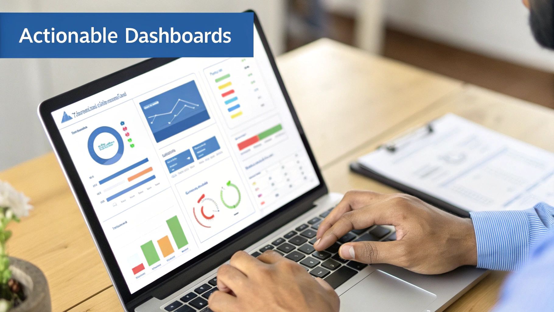
Each component on a dashboard, from a pipeline gauge to a lead source chart, is powered by an underlying source report. The goal is to distill complex data into an easily digestible format.
Choosing the Right Dashboard Component
Select a component that best highlights the insight you want to convey.
- Gauge or Metric: Perfect for tracking a single, critical KPI against a target, such as total quarterly revenue versus the company goal.
- Bar or Column Chart: Ideal for comparing values across different categories. A column chart would effectively visualize the total revenue generated from each campaign in your ROI report.
- Line Chart: The best choice for showing a trend over time, such as tracking your MQL-to-SQL conversion rate month-over-month.
Finally, one of the most powerful dashboard features is the Dynamic Filter. By adding a filter for “Sales Rep” or “Region,” you enable sales leaders to view the same dashboard but filtered for their specific team’s data. This creates a single source of truth that is relevant to every stakeholder, from an individual AE to the CRO.
This type of dynamic reporting is increasingly critical as businesses scale. The growing adoption of tools like Salesforce Data Cloud reflects a broader trend toward data-driven operations. For sales operations, this means shortening deal cycles by leveraging predictive analytics. For marketing leaders, it means boosting engagement through personalization. This growth underscores the need for robust reporting that can handle increasingly complex data. If you are looking to transform raw data into a strategic roadmap, exploring dedicated business intelligence consulting services can provide valuable perspective.
Making Your Reporting Workflow Hum
Building an insightful report is only half the battle; ensuring it reaches the right stakeholders at the right time is what drives action. This is how you transform data from a static artifact into an integral part of your team’s operational rhythm. By automating the delivery of key insights, you ensure data is actively informing decisions across your go-to-market team.
The objective is to shift from a reactive to a proactive reporting culture. Instead of waiting for requests for the latest figures, you push insights to stakeholders automatically. This shift cultivates a data-first mindset, making reports in Salesforce a foundational element of daily work, not just an administrative task.
Get Strategic with Report Subscriptions
Report subscriptions are a simple yet powerful automation feature in Salesforce. You can schedule any report to run and be emailed directly to stakeholders—including specific users, roles, or public groups—on a daily, weekly, or monthly basis.
The key to success is not just enabling subscriptions but developing a strategy behind them. The cadence and content must be tailored to the recipient.
- For Sales Reps: A daily 8:00 AM subscription to a “New Leads Assigned Today” report ensures no opportunity is missed as they begin their day.
- For Sales Managers: A weekly “Pipeline by Stage” report, delivered every Monday morning, provides a consistent snapshot for team meetings and one-on-one coaching.
- For the Executive Team: A monthly “Revenue Attribution by Channel” report, sent on the first of the month, offers the high-level summary needed to assess marketing ROI and overall business health.
This targeted delivery ensures everyone receives relevant information without being overwhelmed. It’s a classic RevOps play that improves efficiency and alignment. To explore streamlining these types of processes further, our guide on workflow automation examples offers practical ideas beyond reporting.
What to Do When Reports Start to Crawl
As your company scales and data volume grows, reports that were once fast can become slow and cumbersome. This common problem falls on RevOps to solve, as a slow report is often an unused report.
A slow-running Salesforce report is more than just an inconvenience; it’s a bottleneck that erodes user trust in your data systems. If a sales leader has to wait five minutes for a pipeline dashboard to load, they will eventually stop using it, making decisions based on gut feel instead of data.
Fortunately, performance issues can almost always be resolved by optimizing your report queries to request only the necessary data.
Practical Tips for Tuning Performance
You do not need to be a developer to improve report performance. It typically comes down to disciplined building and filtering.
Here are a few high-impact adjustments you can make immediately:
- Tighten Up Your Filters: This is the #1 cause of slow reports. Instead of pulling data from “All Time,” use specific, relative date ranges like “Last 90 Days” or “Current Fiscal Quarter.”
- Be Ruthless with Your Columns: Every column added to a report increases the processing load. Review and remove any fields that are not absolutely critical for the analysis.
- Use Joined Reports Wisely: Joined Reports are powerful but can be resource-intensive as they query multiple datasets. Ensure each block in your joined report has tight filters before you combine them.
- Schedule Heavy Lifts for Off-Peak Hours: For large, complex reports, schedule them to run overnight. The data will be fresh and waiting for stakeholders in the morning without bogging down system performance during business hours.
So far, we have focused on historical performance and current pipeline health. However, the true evolution for modern RevOps teams is shifting from reactive analysis to proactive strategy. This is where AI-powered reporting and predictive analytics come into play, transforming your Salesforce instance from a system of record into an engine for foresight.

This evolution is about asking better questions. Instead of, “What was our win rate last quarter?” you can begin asking, “Which of our current deals are most likely to close this quarter, and what actions can we take to increase that probability?” This represents a fundamental shift in how RevOps provides value to the business.
From Historical Snapshots to Predictive Insights
Before fully embracing AI, a powerful intermediate step is historical trend analysis using Reporting Snapshots. This feature allows you to capture point-in-time data from a source report and save it to a custom object. By scheduling snapshots to run daily or weekly, you build a rich historical dataset that shows how key metrics, like your pipeline, evolve over time.
This unlocks answers to critical questions that standard reports cannot address:
- How has our sales pipeline coverage changed month-over-month?
- Which deals are consistently having their close dates pushed?
- Are we generating enough new opportunities to meet future targets?
While snapshots are excellent for understanding past momentum, the future of reports in Salesforce lies in forward-looking tools like Salesforce Einstein.
Unlocking Proactive Strategies with Salesforce Einstein
Salesforce Einstein integrates artificial intelligence directly into your CRM, analyzing your data to identify patterns and generate predictions that a human analyst might miss. It is designed to deliver actionable recommendations, moving your team from data observation to intelligent action.
For RevOps, this unlocks a new tier of strategic capabilities. Einstein does not just present numbers; it interprets their meaning and suggests next steps.
Einstein’s real power isn’t just in its predictions, but in its ability to put data science in everyone’s hands. It surfaces insights like ‘Opportunity Likelihood to Close’ scores right on the record, empowering every sales rep—not just the analysts—to prioritize their efforts based on solid, data-driven probabilities.
This shift toward intelligent automation presents a massive opportunity for B2B companies. Early adopters of AI stand to gain a significant competitive advantage, with studies showing AI can lead to faster issue resolution and substantial improvements in forecasting accuracy.
Practical AI Use Cases for RevOps Teams
Integrating AI into your workflow is about solving real business problems and driving measurable outcomes. The future of reporting, especially with AI, promises powerful new capabilities like Predictive Analytics in Marketing.
Here’s how you can put these tools to work today:
- Einstein Opportunity Scoring: This feature analyzes your historical deal data to assign a score from 1 to 99 to every open opportunity, representing the probability of closing. Reps can instantly identify which deals to prioritize, and managers can focus coaching efforts effectively.
- Einstein Forecasting: Move beyond manual forecast roll-ups. Einstein uses AI to analyze your pipeline and historical trends to deliver more accurate, objective predictions. It can flag deals at risk and highlight pull-ins, giving leaders a more realistic view of quarterly performance.
- Einstein Discovery: This tool acts as an in-platform data scientist. You can point Einstein Discovery at a dataset—like customer churn—and it will automatically analyze millions of data combinations to uncover significant patterns. It might reveal a highly specific insight, such as customers with no support tickets in 90 days and low product usage are 80% more likely to churn.
By embracing these AI-driven features, RevOps teams can transition from being curators of historical data to becoming true strategic advisors who guide the business toward its future revenue goals.
Common Questions About Salesforce Reports
Even experienced RevOps professionals encounter challenges with Salesforce reports. Resolving these issues quickly is key to maintaining a reliable data engine and a continuous flow of insights. This section addresses common hurdles with clear, practical answers.
Consider this your troubleshooting guide for issues ranging from user access control to report performance optimization.
How Do I Control Who Sees or Edits Reports?
Effective data governance is essential when dealing with sensitive pipeline or revenue data. Salesforce uses a simple yet powerful folder-based sharing system to control report visibility.
You can grant three levels of access to any report folder:
- Viewer: Users with this access can view reports but cannot make any changes. It is a read-only permission.
- Editor: An editor can view and modify existing reports within the folder.
- Manager: This role provides full control, including editing and deleting reports and managing folder access for other users.
As a best practice, your executive pipeline summary should be stored in a restricted folder. Grant yourself “Manager” access while providing “Viewer” access to the leadership team. This simple step protects critical reports from accidental edits and ensures data security.
What Is the Difference Between Standard and Custom Report Types?
This question frequently arises as teams’ reporting needs become more sophisticated than what out-of-the-box options provide. The difference comes down to flexibility and how objects are related in your specific Salesforce instance.
Standard report types are the pre-built templates provided by Salesforce. They cover common object relationships, such as “Opportunities with Products” or “Campaigns with Leads,” and are sufficient for many daily reporting needs.
A custom report type is necessary when you need to report on objects in a way that Salesforce has not pre-configured. This could involve linking a custom “Project” object to an Account or reporting on objects that are not directly connected in your data model. Custom report types allow you to build reports that precisely mirror your unique business processes.
Think of it like this: standard report types are the set menu at a restaurant. A custom report type is like going off-menu and asking the chef to create a new dish just for you, using the exact ingredients you want.
My Salesforce Report Is Running Slowly. How Can I Fix It?
A slow-loading report is one of a Salesforce user’s most common frustrations. In nearly all cases, the cause is that the report is attempting to process an excessive amount of data. The solution typically involves smart optimization rather than a complex technical overhaul.
First, tighten your filters. This is the single most effective action you can take. If your report’s date range is “All Time,” change it to a more specific timeframe, like “Current Fiscal Quarter” or “Last 90 Days.” The performance improvement can be significant.
Next, critically evaluate the columns in your report. Each additional field increases the processing load. Be ruthless: if a column is not essential for the analysis, remove it. Finally, if you are using complex formulas, consider whether a simpler bucket field could achieve a similar result. For exceptionally large reports, the best strategy is often to schedule them to run automatically during off-peak hours, ensuring the data is refreshed and ready for your team in the morning.
Ready to stop wrestling with your MarTech stack and start driving measurable growth? MarTech Do specialises in conducting comprehensive system audits, optimising your Salesforce and HubSpot instances, and aligning your go-to-market teams. We build the scalable RevOps foundation you need to succeed. Learn how we can help.